PROGETTI >> REALIZZATI
DIGUSTO//PASTRY&SHOP
PROGETTISTA: Studiounodesign Nuti & Bartolomeo
- Year:: 2016
- Category:: Altro
- Viewed: 938 TIMES
DESCRIZIONE: DIGUSTO Simplicity and style [where taste takes shape]
Digusto is on the ground floor of a newly renovated building which was once a service...
DIGUSTO Simplicity and style [where taste takes shape]
Digusto is on the ground floor of a newly renovated building which was once a service station on the main road of Pontedera, the industrial town which is home to the famous Piaggio company.
The idea of the owner, a pastry chef with many years of experience in the field, was to combine within the same business all kinds of Made in Italy delicatessen, handmade by professional chefs of different culinary arts.
Starting from its name, DIGUSTO (a Studiounodesign idea), was developed as the merging of an Italian expression (di gusto). Digusto means brand, quality and lifestyle, a place where you can enjoy good service and a welcoming environment where you can appreciate the uniqueness of its setting. Intentionally modern, though definitely Italian, Digusto aims for simple style and healthy food. Turning the Italian expression into a single word makes it easier to remember and so leaves its mark on the customers memory. Digusto allows the use of other expressions and meanings (i.e. Digusto the appetizer!, You can never get enough of Digusto, etc.)
The design of the coffee bar is in line with the idea of functionality in terms of the arrangement of space, which was intended to be simple and tidy and in a conceptual and modern style.
The main area is long and narrow with pillars and floor-to-ceiling windows.
Designing Digusto was, however, a challenge for Studiounodesign which wanted to preserve and emphasize the length of the space, so as to create three different areas and provide a perfect setting for everything between breakfast and happy hour.
The furniture and decor are classic, so as to make the environment warm and friendly.
The rather dark and sharp tones create a background of delicate nuances ranging from beige to pearl-grey with four varying shades of lilac.
The design of the pearl-grey and black-iron leather couches is in contrast with the leather and wooden chairs and with the square tables that have a black base of cast iron in retro style. This also creates a boundary between the coffee bar and the restaurant area.
The different shades of the leather seats, with high-quality handcrafted upholstery, is a remarkable sign of state-of-the-art product selection, which is also our greatest source of pride.
Our refined furnishing accessories and their highly selected details are framed by LED lights that run along all the interior walls. Seen through the floor-to-ceiling windows from the outside, the lighting enhances the space and gives harmony to its furniture.
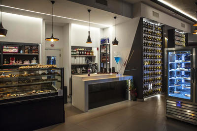
The bar counter, which runs between the two main entrances has a countertop in white Corian, which is in contrast with the much darker background.
The linearity of the bar is expressed by the floor-to-ceiling windows of the pastry and coffee bar.
Detached from the main counter there is the ice-cream display counter. The unique, cutting-edge counter is equipped with wells and tubs and LED lights to highlight the natural colours of the ice-cream on display.
The mat black (outside) and brass (inside) hanging lamps are consistent with the other metal elements in the typical industrial style of Digusto. The contrast between the two materials is amplified when the lamps are on, while the winding and elegant form of the lamps is offset against the sharp lines of the bar and tends to bring to mind an image of old pots and jars.
On the walls between the bathrooms and the customer area there are modular bottle racks which elegantly and functionally display the different bottles. They are made of laser-cut iron, with light colours to intentionally create a contrast with the dark background and spotlighted by LED lamps behind the panels (ENO Collection by Elite, to be). Its a great way of enhancing and uniting the bar and the restaurant areas.
The decorations, especially on the wall of the restaurant area, were designed in collaboration with EDF crew.


